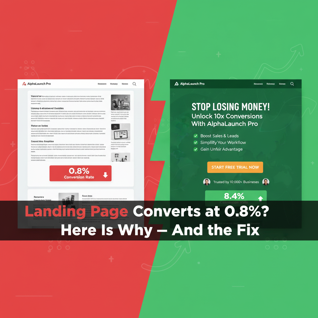
You are paying for ads,
publishing content, and driving social media traffic — but your landing page
converts at 1-2% when it should be achieving 5-15% or more. Every percentage
point of conversion rate improvement directly multiplies the return on your
existing traffic investment without spending another dollar. A page converting
at 4% instead of 2% effectively doubles your ad results at zero additional
cost.
This guide systematically
addresses every major reason landing pages fail to convert, with specific,
implementable fixes for each.
The Message-to-Market Match: The Foundation
The most common cause of low
conversion rates is a mismatch between what your traffic source promises and
what the landing page delivers. If someone clicks an ad for '50% off running
shoes' and lands on your homepage or a general sale page, they experience
cognitive friction — the promise was not kept.
Fix: Every traffic source should
link to a specific landing page that mirrors its exact promise. Ad says 'Free
SEO audit for law firms' → landing page headline should say 'Get Your Free SEO
Audit for Law Firms.' The continuity must be pixel-perfect.
The Headline: You Have 3 Seconds
Research by Nielsen Norman Group
found that visitors decide whether to stay or leave a web page within 3-5
seconds — based primarily on the headline. If the headline does not instantly
communicate clear value, visitors leave.
Anatomy of a High-Converting Headline
•
Clarity beats cleverness every time: 'I Help Coaches
Get 10 Clients Per Month Using Instagram' converts better than 'Unlock Your
Coaching Potential'
•
Address the visitor's primary desire or biggest problem
— not your company or product features
•
Specific beats vague: '50 Qualified Leads in 30 Days'
beats 'More Leads for Your Business'
Supporting Subheadline
The subheadline expands on the
headline promise, addresses the 'how' or 'why you specifically,' and bridges
the gap between initial attention and reading further. Keep it to one clear
sentence.
Social Proof: Removing the Biggest Objection
The biggest invisible objection
on most landing pages: 'Why should I trust you?' Social proof answers this
before visitors can consciously form the question.
Types of Social Proof and Placement
•
Customer testimonials with full name, company, and
photo: real people are far more persuasive than anonymous quotes
•
Number of customers served: '2,400+ business owners
trust [product name]'
•
Logo bar for B2B: showing recognizable company names
who are customers
•
Case study results: specific, measurable outcomes
('Sarah generated $23,000 in her first 60 days')
•
Star ratings and review counts: particularly powerful
for e-commerce
Placement: social proof should
appear in multiple locations — near the headline (for scanners), near the CTA
(to address objections at the point of decision), and in the form itself if
relevant.
The CTA Button: Often the Most Under-Optimized Element
Most CTA buttons say 'Submit' or
'Sign Up' — generic, value-free, and uninspiring. Your CTA button is the last
thing a visitor sees before converting. Make it work harder.
CTA Button Optimization
•
Value-focused text: 'Get My Free SEO Audit' beats
'Submit.' 'Start Saving Money Today' beats 'Sign Up.'
•
First-person language: 'Send Me the Guide' consistently
outperforms 'Download the Guide' in A/B tests
•
Color contrast: the CTA button must visually stand out
from everything else on the page. Orange, green, or red on white pages
consistently draw attention.
•
Size: large enough to be immediately visible on mobile
without zooming
•
Friction-reducing microcopy below button: 'No credit
card required,' 'Cancel anytime,' '100% free'
Benefits vs. Features: The Critical Copy Distinction
Features are what your product
does. Benefits are what those features mean for the customer. Most landing
pages list features. High-converting pages lead with benefits.
Example transformation:
•
Feature: 'Automated email sequences' → Benefit: 'Follow
up with every lead automatically, even while you sleep'
•
Feature: '24/7 customer support' → Benefit: 'Never wait
for help when you need it most'
•
Feature: 'Cloud-based platform' → Benefit: 'Access your
account from anywhere, on any device'
For every feature you consider
listing, ask: 'So what? What does this mean for the customer's life?'
Form Optimization: Reduce Friction
Every additional field in a form
reduces conversion rate. Research suggests adding a single field can reduce
conversions by 10-15%.
Form Best Practices
•
Ask only for information you absolutely need at this
stage. For lead generation, name and email is usually sufficient.
•
If you need more information, use multi-step forms —
people who complete the first step are committed and more likely to finish
•
Remove 'Reset' or 'Clear' buttons — they exist only to
destroy completed forms accidentally
•
Add a privacy statement near the form: 'We never share
your information. Unsubscribe anytime.'
Page Speed: The Silent Conversion Killer
Google research found that 53%
of mobile visitors abandon pages that take more than 3 seconds to load. Every
additional second of load time reduces conversions by approximately 7%.
Test your landing page speed at
PageSpeed Insights (pagespeed.web.dev). The most impactful improvements:
compress images to WebP format, defer non-essential JavaScript, use a CDN, and
choose a fast hosting provider.
Mobile Experience
Over 60% of web traffic now
comes from mobile devices. A landing page that looks great on desktop but has
tiny text, horizontal scrolling, or a barely clickable CTA button on mobile
loses the majority of its potential conversions.
Mobile-specific requirements:
CTA button minimum 44px tall, text minimum 16px, single-column layout, form
fields large enough to tap accurately, no elements that require horizontal
scrolling.
A/B Testing: Let Data Decide
A/B testing (split testing)
shows two versions of your landing page to different visitors and measures
which converts better. This removes subjective opinion from conversion
optimization.
Testing Priority Order
1. Headline
(highest impact, test first)
2. CTA
button text and color
3. Above-the-fold
layout
4. Social
proof placement and type
5. Form
length
Use Google Optimize (free), VWO,
or Optimizely for A/B testing. Run each test until you have statistical
significance — typically 100+ conversions per variation.
Conclusion
Landing page optimization is one
of the highest-ROI activities in digital marketing because it multiplies the
return on every traffic source without additional spend. Start with the
message-to-market match (does your landing page deliver exactly what each
traffic source promises?), then systematically improve headline, social proof,
CTA, and page speed. Each improvement compounds: a page converting at 8% from
the same traffic as a 2% page generates four times the customers from the same
investment.
Category:
Digital Marketing
Tags:
landing page optimization, increase conversion rate, CTA button
tips, A/B testing, landing page copy