A website can be
technically flawless — fast, secure, accessible, beautifully coded — and still
fail at its actual job: converting visitors into customers, subscribers, or
leads. Technical excellence and conversion effectiveness are two different
things, and developers who understand both are rare and enormously valuable.
This guide bridges that
gap. These are the user experience and design principles that determine whether
a visitor stays, engages, and takes the action you want them to take —
translated into actionable techniques you can implement in your code and design
decisions.
What Is Conversion and Why Does It Matter?
A conversion happens when
a visitor takes a desired action — buying a product, signing up for a
newsletter, filling out a contact form, downloading a resource, or calling your
phone number. Your conversion rate is the percentage of visitors who complete
that action. Improving conversion rate is often more impactful than increasing
traffic: doubling conversion rate from 1% to 2% doubles revenue without a
single extra visitor. This is why companies invest heavily in Conversion Rate
Optimization (CRO).
Principle 1: Clarity Beats Cleverness
The most common UX mistake
is sacrificing clarity for creativity. Visitors do not read websites — they
scan. They make a split-second decision about whether a page will give them
what they need. If your headline is a clever pun that requires thought to
decode, you have lost them. Your main headline should immediately answer three
questions: What is this? Who is it for? What should I do next? Test your
headline by showing your homepage to someone unfamiliar with your business for
5 seconds and asking them what the site is about. If they cannot answer
clearly, the headline needs work.
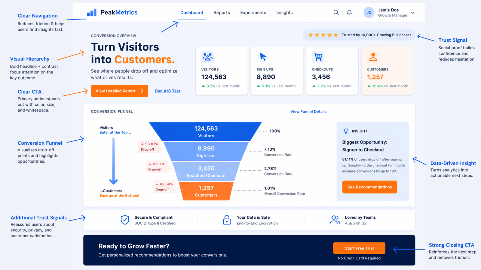
Principle 2: Visual Hierarchy — Guide the Eye
Visual hierarchy is the
arrangement of elements in order of importance, guiding visitors through your
content in the sequence you intend. Establish hierarchy through size (larger =
more important), contrast (bold, bright elements draw the eye), color (a single
accent color for all CTAs creates automatic hierarchy), whitespace (elements
surrounded by space feel more important), and position (top-left gets attention
first in cultures that read left-to-right, then the eye follows an F or Z
pattern). Every page should have one primary element that is visually dominant
— usually your main call to action or value proposition.
Principle 3: Effective Calls to Action
Design
CTA buttons should be
visually distinct from everything else on the page. Use a consistent,
high-contrast color reserved only for CTAs (never use that color for decorative
elements). Make buttons large enough to tap easily on mobile. Use whitespace
around them. A border is weaker than a filled button — use filled for primary
CTAs.
Copy
Button text should
describe the action and value, not just the action. 'Sign Up' is weak. 'Start
Your Free Trial' is better. 'Get My Free Plan' is better still — it uses first
person and makes the benefit explicit. Avoid vague labels: 'Click Here',
'Submit', 'Learn More' are all missed opportunities to communicate value.
Placement
The main CTA should appear
above the fold (visible without scrolling on most screens). Repeat it after any
section that builds value or explains benefits. Long pages should have multiple
CTAs. But do not have multiple different primary CTAs competing for attention
on the same screen — one clear primary action, one page.
Principle 4: Reduce Friction at Every Step
Friction is anything that
makes the visitor's path to conversion harder. Every extra form field is
friction. Registration walls are friction. Slow load times are friction.
Difficult navigation is friction. Unclear next steps are friction. The principle
is relentlessly reducing friction: ask for only the minimum necessary
information in forms. Offer guest checkout in e-commerce. Remove navigation
from landing pages dedicated to a single conversion goal — navigation gives
visitors an escape route. Use autofill-friendly form attributes
(autocomplete='email', etc.) so browsers can help users fill forms faster.
Principle 5: Build Trust Immediately
Visitors cannot physically
inspect your product or see your office. You must establish trust through the website
itself. Trust signals include: real, specific testimonials with full names and
photos (not generic quotes). Case studies with quantified results. Trust badges
(SSL, security certifications, payment logos for e-commerce). Social proof (X
customers, Y reviews, featured in [publication]). Clear contact information
including a physical address and phone number — hiding these destroys trust.
About page with real team photos and names. A modern, professional design —
users judge credibility by visual design within 50 milliseconds of landing on
your page.
Principle 6: Mobile Experience Is Primary
More than half your
visitors are likely on mobile. But mobile optimization goes beyond making
things responsive. Tap targets must be large enough (44x44px minimum). Forms
must work well on mobile keyboards — use appropriate input types (type='email'
shows an email keyboard, type='tel' shows a number pad). Pop-ups that cover the
full screen on mobile are a Google ranking penalty trigger and a user
experience disaster. Test your full conversion flow on a real mobile device,
not just in DevTools.
Principle 7: Page Load Time Is a Conversion Factor
Portent research found
that a 1-second page load time has a conversion rate 3x higher than a 5-second
load time. Every extra second of load time costs conversions. Speed is not just
a technical nicety — it is a direct business metric. Prioritize load time for
your most important conversion pages: home page, product pages, landing pages,
and checkout.
How to Test and Improve Conversions
A/B testing is the
systematic way to improve conversions. Tools like Google Optimize (free), VWO,
or Optimizely let you show two variants of a page to different visitors and
measure which converts better. Test one element at a time: headline first, then
CTA button text, then CTA button color, then page layout. Run tests long enough
to reach statistical significance — usually at least two weeks and several
hundred conversions per variant.
Heatmaps and Session Recordings
Hotjar and Microsoft
Clarity (free) record visitor sessions and generate heatmaps showing where
visitors click, scroll, and move their cursor. This qualitative data often
reveals problems that analytics cannot: a button that looks clickable but is
not, content that visitors stop reading at consistently, or a form field that
causes high abandonment. Session recordings are particularly illuminating —
watching real users interact with your site is humbling and immediately reveals
what to fix.